

Page Builder 2.0 - Sections and Elements
Add a Section
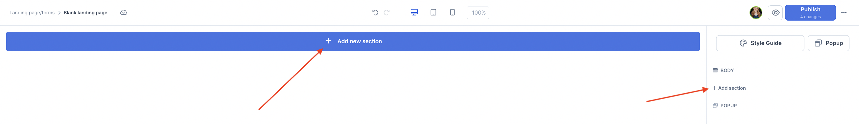
The first thing you need to add to your landing page is a section:
Options will show up on a popup. Pick either from the templates or a blank section (bottom left corner of the popup):

NOTE! This popup will also appear when you first create the page, to help guide you ✨
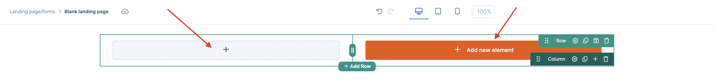
When you hover on the section, you’ll be able to perform several actions:
Open the Section Settings, duplicate the Section, or delete the Section.
Open the Column Settings, duplicate the Column, delete the Column, and adjust the Column Width.
Add an Element to the Column, add a new Row, or add a new Section.
Add an Element
Wherever there’s a plus button, you can add an element to it. Click on it to pick among the different element types!
In the popup, you’ll see a whole bunch of element options to choose from. Spoiler alert: There are several 🎉

There are 5 Categories of Elements:
General: Preheadline, Headline, Subheadline, Paragraph, Bullet list, Button, Input, Progress Bar, Countdown timer
Objects: Blog posts, Contact form, Courses, Events, Order form, Products, Scheduling link, Search bar, Survey, Testimonial form, Testimonials
Layout: Stack, Spacer
Media: Audio, Image, Video, QR Code
Advanced: HTML, iFrame
We’ll go through some of the most popular elements from each category below:
General Elements
Text
If you select a General text element such as a Preheadline, Headline, Subheadline or Paragraph, you can type in the text directly on the element preview.
NOTE! When you select the text, a floating text editor will also be displayed for text formatting:
-
Buttons
There are 5 actions available to fire when someone clicks on a Button:
Go to link
Opt-in to a list
Open page popup
Register for an event
Popup order form
1-click purchase
Scroll to Section on page
Scroll to Row on page
Scroll to another section on the page
Download a file from your Media Library

-
Inputs (or Form Fields)
Select the field the input will be used for, then choose a Label Style (Above field, Inline, or Floating):

Inputs are generally used alongside buttons to build an Opt-In Form, but they are not limited to that use case.
Bullet lists
This will create a list:
You can change the icons by clicking on Browse icons on the right side and following steps 5 and 6 in this guide.
Object Elements:
-
Contact form
In the contact form settings, you can choose the following:Forward submissions to an email address or create a support ticket
Show a message after they submit the form, or redirect to a URL
Label Style - Above Field, Inline or Floating
Customise the Button
Choose the Labels for the Name, Email and How can I serve you? fields

-
Order form
Embed an order form for any of your products. This is a great way to customise product checkouts.
First, choose the Product to connect the order form to:

You can also choose which Price is automatically selected by toggling on the Lock Price option:

You can hide the Order Summary:

You can add a Decline Offer link beneath the payment button:

You can disable Coupon Removal, which hides the cross to remove an applied coupon:

And you can limit to 1 Applied Coupon, which means once there's a coupon applied, the customer won't have the option to replace it with another coupon:

Layout Elements:
-
Spacer
Add space between any of your elements by adding the Spacer element.Choose the height (in pixels)
Add a horizontal line (optional)

Media Elements:
Pick the media file from your library using the media box or the +Add button on the right sidebar.
You’ll also have the option to customise other media specific settings like Alt text or Link URL for Images, or whether to Loop the Video or Audio file.
Advanced Elements:
HTML
If you need to embed a script code on the page, for example, you can use this element:
Add a Popup
With the Page builder 2.0, it’s easy to add a popup to your page.
Click on the Popup icon to customise the popup content and format, then click on ‘Add section’ to add elements to your popup or start from a template:


Only Show on Some Devices
When you make changes to Tablet or Mobile settings (on the right side bar), these changes will only appear for the device you make them on (this is called Responsive Mode).
However you can also set any Section, Row, Column or Element to only show up on certain devices at any time.
For example, if you need to add or delete certain rows, columns or elements inside a section and you only want these changes to show up on tablet, these changes would also affect desktop and mobile. So you’ll want to duplicate the section and have each one show up on a different device (based on the changes you make).
To show your section only on some devices (Mobile, Tablet, or Desktop), hover over that section on the list of sections on the right-hand side and choose the devices that you want to show it on:

You can also hide it from all visitors by clicking on  next to the section title, or choose All to show it on all devices again.
Reminder! You can also do this for a Row, Column or Element.
Saved and Global Blocks
You can save any Section, Row or Element as a Saved Block and use it later in any other page.
You can also save it as Global Block. Any change you make to a Global Block will be automatically updated everywhere you're using that Global Block!
This very powerful feature enables you to do things that were either not possible or very hard to do with the old builder.
Save It as a Saved or Global Block:

See and Select Your Saved and Global Blocks When You Add a New Section:

Edit the Global Block:
Your changes will update everywhere the Block is in use:

You can manage Saved blocks via Account settings >> Marketing >> Saved blocks:


Remove the Global Block
This will make the block become a regular section again. Inside the builder, click on the unlink button:

You can also delete it from the saved blocks table.
Suite 92530
New York, NY 10003
United States