

Page Builder 2.0 - Responsive Mode
When working on Page Builder 2.0, we can switch from the top icons to see the preview of our page on Browser, Tablet, and Mobile:
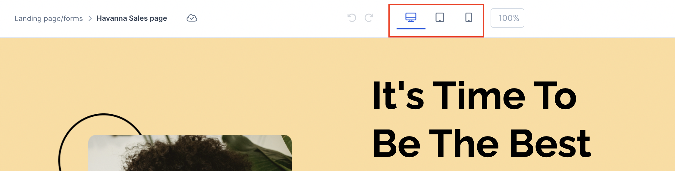
We also have the ability to edit their settings individually, which is called "responsive mode".
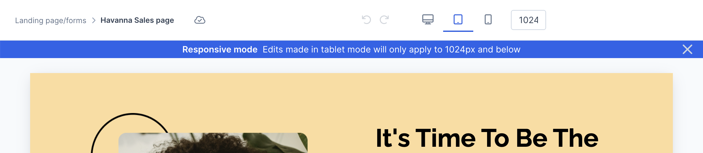
When using the tablet or mobile view, you will see a banner warning that responsive mode is active.
Tablet View:
Mobile View:
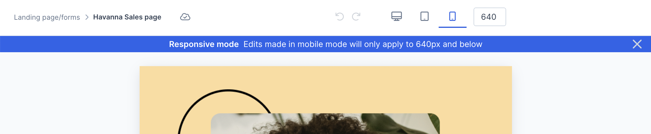
When in responsive mode, only edits made on the right-hand panel will apply exclusively to the view from the limit px indicated via the banner. Moving or adding elements will edit all views.
Mobile view will default to 640px due to the page builder breakpoint which aligns with most devices being in landscape mode. Most mobile devices are around 350px which you can reduce the size either on the top:

Or by moving in the bars on the sides of the page:

This will allow you to ensure that your page is showing a more accurate mobile view of your live page.
Any aspects of the page that have set pixel specifications will also need to be adjusted for the mobile view in order to continue staying responsive. Otherwise, you can always utilize % for sizing.
Automatic Stack of Row Columns
In Mobile view, rows with several columns will automatically stack in individual rows.
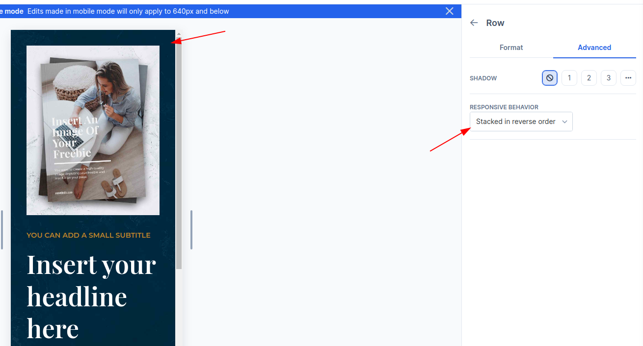
You can adjust the way rows are stacked (reverse stack) or to not stack at all (none).
For example, the automatic stack order of the Bourbon design is the first column (text) at the top, then second column on the row (image) below it:
“Stacked in reverse order” under Row Settings > Advanced allows you to place the image at the top, then the text below it:
If you want to hide or show elements per view, you can hide elements based on view as explained in this guide.
Suite 92530
New York, NY 10003
United States