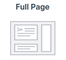
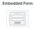
You have two choices of opt-in forms which include:


So what is the right one for you?
It all depends on what you’re looking for, so let's assess the difference:
A full-page landing page is ideal when you have more information to convey. A great example of this would be if you have a list sign-up for a webinar. Here you’d want to convey to them the date, why they want to be on your webinar and what they will learn.
Bottom line is, your opt-in needs to be more like a sales page and not a pop-up box - so a full page landing page is the way to go.
Embedded opt-in forms are great when you don't have a lot of information to convey to your lead before getting them on a list. An example would be getting them on your newsletter email list. Here you’d only need to convey to them that is what they’re doing, and then collect their name and email.
Embedded opt-in forms are generally pop up boxes that could appear if your lead clicks a link, or scrolls to a certain point on a page. Or maybe it comes up when they land on a page of your website or when they try to exit. But it can also exist as a permanent form on your website home page (or any page you desire).
Use the Raw HTML code if you want to use the form somewhere else. This type of signup form has no styling from Simplero. You add the styling in whatever system you use to display the form, such as a WordPress page, Leadpage or WebinarJam. You can't make any edits within Simplero to this form.
Related content
For step-by-step instructions on creating Full page landing pages, check out this guide.
For step by step instructions on creating and embedding opt-in forms, check out this guide.
Occasionally the need may arise to have more than one opt-in form on a single landing page. Maybe you have one webinar being held on different dates. We make that easy with the creation of a single landing page mixed with multiple embedded opt-in forms. For a step by step instructions on this, check out this guide.