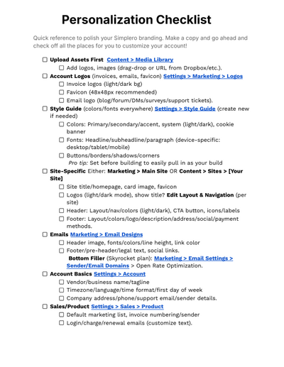
Hi, folks.My name is Justine.I am a support specialist here with Simplero, and we are gonna go over some important branding of your account.So to start, we're gonna go over the colors and logos.You can find that up here with the settings section under colors and logos.
0:19
This is where you're going to end up setting up all of your text colors, your links, accents, buttons, and backgrounds.Now this is gonna be account wide.So this is going to be something that you're going to set, and then your themes and and everything, we will go over after a bit.We do have this guide right here, that you can click and go over to see exactly where different things are going to be affected.The fun thing about having your brand color set right here is you can easily go into your email broadcast and things like that, and it already populate the colors of your brand so that you can easily reference those.
1:02
You can also set up 2 different logos, one for a white background and then one for a colored background that are gonna be applied onto things like your order form, your receipts, and various things.Next, we have your favicon.The favicon is what is gonna be shown up here in the top left hand corner, of the tab.So if you don't want the Simplero, icon to be showing, you'll just upload your own account, or brand favicon right there that you'll have that will show up here in the tab.Next, we're gonna go into the themes.
1:41
Now themes are gonna apply to landing pages and websites.Whatever you do to change the theme is going to be applied to any of the things that are already using it.So if I were to change anything on this thing right now, the 4 or 5 different things that are already using this, such as landing pages and membership sites are gonna take on whatever I do to change this.The awesome thing about the themes within, the settings tab is that you can go ahead and change all these colors.You'll see them automatically change right here as you do it.
2:17
So for example, if we have this background and we want to make it let's do a lace nice pretty pink.You're gonna see exactly what it looks like on the page, before anything fully changes and is saved.You'll get a preview of what it looks like.So you can change your background.As you can see, this is what it's gonna look like.
2:37
Your alternate background is what you're gonna do use if you are in a setting, especially in the landing pages and the different sections, and you pick alternate.It's going to take on that alternate background color instead of the general, the basic one.Your accent colors, your secondary colors, and your border colors, that's all here in the general section.The accent colors are used for your text links, your buttons, lines, and and sometimes even backgrounds.And you can just change all of that.
3:10
If you have borders, that's obviously gonna get changed.When you text, so, like, if you have different sections like right here, if you have a heading, you're gonna have a different color.So we're gonna change the heading real quick, and we're just gonna see how that changes right there.So this is a heading that's automatically changing.Now if you have regular text, we're gonna change that.
3:33
We'll do just so you guys can see.So regular text gets changed right like that.It's really awesome that it automatically changes so you can get a preview whether or not you actually like how it looks.For things like success, which is like something goes through, you can change the color for that as well.All of this is super customizable, buttons.
3:57
So for, like, buttons like this or right here, this is right here.You can change the background, and we'll do the text color, different color like that.And then you can see that it populated right there.It's the same with all of these different things.So all these things are gonna be applied to your membership site.
4:20
And then you can go down here, and you can have your background.We can change your background.It's all pretty self explanatory, but it is pretty important that you remember that any changes that you make to the theme is going to apply for those different, membership sites and and, landing pages that are already applied for.So we're gonna go back into that.So now we've gone over the colors.
4:46
This is the typography.So you can actually change the typography of different sections on your landing pages and websites.You don't have to have the basic one.It's a really great way to kinda personalize it and put text that you prefer.And you don't have to have all of the different sections be the same thing.
5:05
Your heading can be 1.We can do your body of the text.Is it different?And then we can also do, the buttons can either be this body or the headings.So you can pick between these 2 that are gonna end up affecting the button.
5:25
Next, we have the navigation that you can personalize.You can either have it small, medium, large.It's kind of up to you what you would like to do with it.It's kind of like a visual aspect.So as you can see, it's kinda changing up here.
5:38
And you can also have it stick to the top.You can also change the location.You can have the top or you can have it to the left.And then you can apply your logo.Logos while you can have the logo in your account itself, there's also logos that you can apply to the theme.
5:59
So if you were to change your logo in settings for your account, you'll want to make sure that you update that within the theme as well because it's not always going to correlate directly.So you're gonna do that.If you have a different, logo or if you wanna have a specific favicon for the theme that is gonna be applied to these memberships, you're gonna be able to apply those right here.This is just more information if you wanna do a call to Calvin, at the top of it.So we're gonna just do, submit now just so you can see if it's gonna show.
6:42
I guess it doesn't wanna show.And then we'll go like that.So it gives them a link.Alright.And then you can actually change the color.
6:55
Maybe that'll show.And as you can see, this automatically shows the low the brand, colors of your account.So if you want to reference those and make everything look more cohesive, you can.Yeah.So then next, we're gonna go into the announcement banner.
7:17
You can adjust the background color and text of that as well if you have it.You can have it show only on your home page.You can have it do it a link in a new tab.So if you want them to click it and then go to a different tab, banner, and then you can change the link for that.Alright.
7:45
Next, we're gonna go into the footer.So this is gonna be down here.So you can actually change the footer footer.You can do either the simple or the breathe.It's really up to you which one you prefer.
7:59
And then you can also have your logo if you would like.It just kinda changes the layout of everything.You can also remove your address.So if you don't want your address that's shown in your account to be shown on the pages of this website, then you can also remove that down here by just clicking this right here.You can also show your payment methods or you could remove that as well.
8:23
It's kind of up to you what you would like to show.Cookie consent.This is just to warn them if they want to save cookies or not, and then you can actually customize that as well.You can also customize position of it left, right.You can have it as a banner on the top or the bottom, and you can also, like, change the layout of it.
8:46
So this is what the edge list looks like, classic, and block just to give you a preview.And this is what it is on the floating left.Floating right would be on this side, obviously.And then if you want it on a banner instead, you can just have that right at the bottom.You can also move it to the top just the same.
9:12
Next, we're gonna do the sidebar.So if you wanna have the sidebar, you can make it present or you can have it hidden.That's kind of up to you whether you want it.You can have it on the left side.You can have it on the right side.
9:25
We don't really have any pages connected to this right now, so I can't really show you that part.If you have a blog, you can have the show sharing button.There's not a whole lot of customization on this part of the templates, unfortunately, the same with the products.And then if you wanna add, additional CSS files or JavaScript files, you can do that here as well.So this is just going to apply to whatever landing pages or, membership sites that you're gonna choose to use.
10:00
And for example, if we go into the main website, we'll click right here.No.Click the wrong thing.No.No.
10:11
I didn't.We'll just go into here real quick, and you can see that you can change the settings in here, and you can customize the theme within the landing page as well.So if you wanna customize it, you can go in, and you're able to access that really easily.Go back.You can also go in and change the different sections.
10:38
So even if you end up, having your theme set but you want your landing page to be a little bit different.So, like, for this one, right now it's on a custom appearance.But if we go to the default, it's gonna automatically use the, background color that we set as part of the theme.The same with the alternate, when you pick the alternate, it's gonna automatically pull that alternate, color that you've already picked within the theme.And there's so much more customization that you can do even more in the landing pages, as well.
11:13
Let's see.And then we're gonna actually go over the email branding as well, the email templates, and I'm gonna show that.And just wait for this to load.Get out of here.Maybe.
11:42
Maybe not.Okay.Get out of that, and we're gonna go into email designs.Alright.So when we go into your email templates, you can edit these.
11:55
You can have it based on a different template.You can add your header image, which, there is a disclaimer to make sure your header image is not over 600 pixels wide.You can also have a URL link to your header image.So if they click your header, then it will automatically direct them to a URL.You can also change the text of your or the font of your text within your emails, your broadcast, and this is going to apply to all text.
12:24
So if you want to have a different type of text for each section, you would actually have to add some custom code, which can't unfortunately help with.But this will be a overall, application of text, format for you.You can also pull in and specify different colors within it.You can specify the size, how big or how wide you want your line height to be, if you want your text color to be one thing and your link color another.And then you can also update your header.
12:56
So if you have a recipient specific footer, this is gonna be updated right here.You can change the background color and the text, and the same with the preheader and legal footer.The legal footer is right here, which allows them to actually, unsubscribe and manage their preferences.If you want to add a custom footer, you would actually have to go into, your list.You can apply custom footers via list or products.
13:29
When you go into your list, for example, we're gonna go to this one, and you can edit all of this, and we will add text to footer and emails to this list.So this is where you're gonna put your custom footer, whether it's a picture or your signature or what have you.This is where you're gonna put any important custom footer information that you would like based off this list.It's the exact same thing for your products as well.So if you wanna add that same footer for anybody who would be getting mail based off of a product, then you would just go in and you would copy this and paste it over to the product footer as well.
14:15
As far as personalizing in your account, I think we've pretty much covered everything.If you have any extra questions about trying to personalize your account and make it your own, please feel free to ask.Our support staff is more than welcome are more than happy to help you.
very confusing..some functions not working in tutorial. Too quick to remember. Need a working tutorial to follow along. Watching it too difficult